How to use RefineR App
This post gives detailed explanation of the use of the RefineR App. Brief instructions are available in the app itself (Info button). The principles of the refineR algorithm are described separately.
Import
The RefineR App accepts Excel files (extension ‘.xlsx’ or ‘.xls’). In addition to results, you may also include data for patient age and sex in the spreadsheet. These parameters allow partitioning during analysis but are not essential. If age is included, values should just be numeric, i.e. ‘35’ not ‘35 y’. Column names are needed in the spreadsheet, but any names can be used and the columns can be in any order. Once the data is uploaded, you can tell the app what each column represents.
When you have a spreadsheet ready to import, go to Select Excel file and click Browse. Once it has been uploaded, it will appear under Preview of imported data.
Format
The data is then formatted so that the app can read it correctly. Use the drop-down boxes in the sidebar to select the columns that contain results, age and sex. (Select None if no age or sex). If the spreadsheet has results for multiple analytes you want to analyse, just select the one you want to do first, then come back to this step when you are ready to move on to the next one.
If there is sex data, its format needs to be specified. The options are M/F and Male/Female. Don’t worry about upper and lower case here, e.g. ‘F’ and ‘f’ will both recognised as female if M/F is entered as the format; similarly, ‘Female’, ‘female’ and ‘FEMALE’ will all be recognised if as female, if Male/Female is selected.
Once all the formatting selections have been make, click Apply format. If the preview of formatted data looks ok, click Go to analysis.
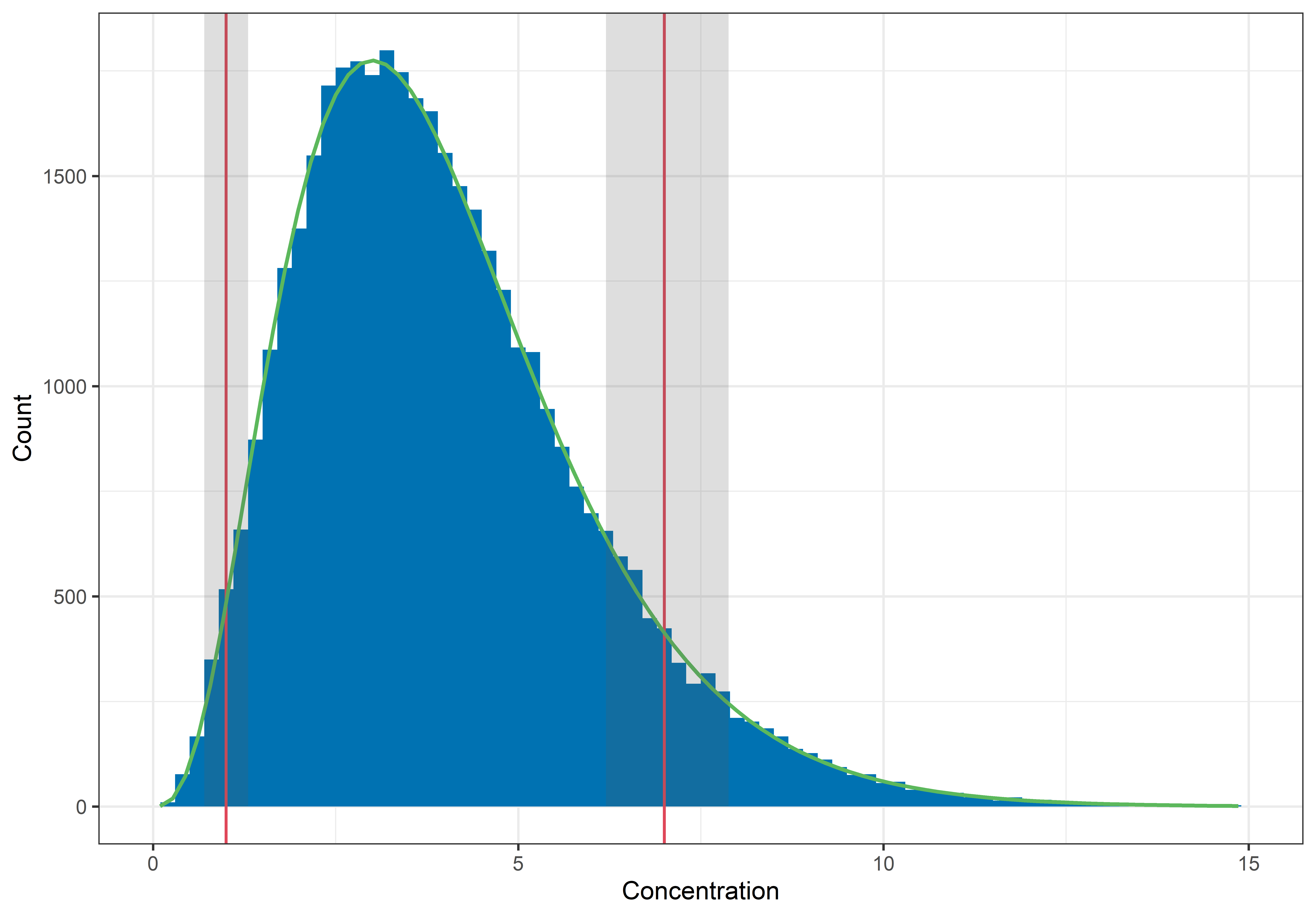 |
|---|
| Figure 1. The finished product. Once analysis is complete, the refineR reference limits will be displayed on the histogram (red), along with their confidence intervals (if Bootstrapped CIs was selected; grey) and a curve representing the distribution of results from healthy individuals (green). |
Filter and analyse
In this tab, a histogram is displayed with options in the sidebar for filtering the data by age and/or sex. This allows for analysis of results from particular subgroups.
There is also an option to set minimum and maximum result values. Often patient data will contain some extreme values and, if these are excluded, it is easier to visualise the important central component of the histogram.
RefineR will automatically pick a binwidth for the histogram. This can be manually changed to improve the look of the histogram by clicking on Adjust binwidth. Manually changing the binwidth will not affect the refineR calculations.
The final option in the sidebar is Bootstrapped CIs. This allows calculation of the confidence intervals for the upper and lower reference limits by bootstrap resampling. Simply click on the button and then specific the number of bootstrap repetitions you would like the algorithm to perform. Calculating bootstrapped confidence intervals adds significant computation time, however, because the analysis is being repeated many times.
Once all the sidebar parameters are set to your liking, click Analyse. Because of the complexity of the algorithm, it can take a while to calculate. Once analysis is complete, the reference interval and the predicted distribution of results from healthy individuals will be displayed on the histogram (Figure 1). The reference interval will also appear underneath the histogram. The number of decimals places used for the reference interval can be changed using the ‘slider’.
After analysing, there will be an option at the bottom of the page to ‘show results table’. Selecting this tick box displays a summary table of the data, filters and refineR parameters. This can help with comparison between analyses. You also have the option to ‘download word report’. This will generate a report with the summary table and graph from your analysis.
If you have any questions or issues with using the RefineR App please email goCrunchAnalytics@gmail.com
