How to use BhattApp
This post gives detailed explanation of the use of the BhattApp. Brief instructions are available in the app itself (Info button). The principles of Bhattacharya analysis are described separately.
Import
BhattApp accepts Excel files (extension ‘.xlsx’ or ‘.xls’). In addition to results, you may also include data for patient age and sex in the spreadsheet. These parameters allow partitioning during analysis but are not essential. If age is included, values should just be numeric, i.e. ‘35’ not ‘35 y’. Column names are needed in the spreadsheet but any names can be used and the columns can be in any order. Once the data is uploaded, you can tell the app what each column represents.
When you have a spreadsheet ready to import, go to Select Excel file and click Browse. Once it has been uploaded, it will appear under Preview of imported data.
Format
The data is then formatted so that the app can read it correctly. Use the drop-down boxes in the sidebar to select the columns that contain results, age and sex. (Select None if no age or sex). If the spreadsheet has results for multiple analytes you want to analyse, just select the one you want to do first then come back to this step when that one is done.
If there is sex data, its format needs to be specified. The options are M/F and Male/Female. Don’t worry about upper and lower case here, e.g. ‘F’ and ‘f’ will both recognised as female if M/F is entered as the format; similarly, ‘Female’, ‘female’ and ‘FEMALE’ will all be recognised if as female, if Male/Female is selected.
Once all the formatting selections have been make, click Apply format. If the preview of formatted data looks ok, click Go to analysis.
Filter and analyse
In this tab, a histogram and Bhattagram are displayed with options in the sidebar for transforming and filtering the data. There are multiple options for data transformations.
There is the option to filter for age and sex, so that results from particular subgroups may be analysed.
There is also an option to set minimum and maximum result values. Often patient data will contain some extreme values and if these are excluded it is easier to visualise the important central component of the histogram and Bhattagram.
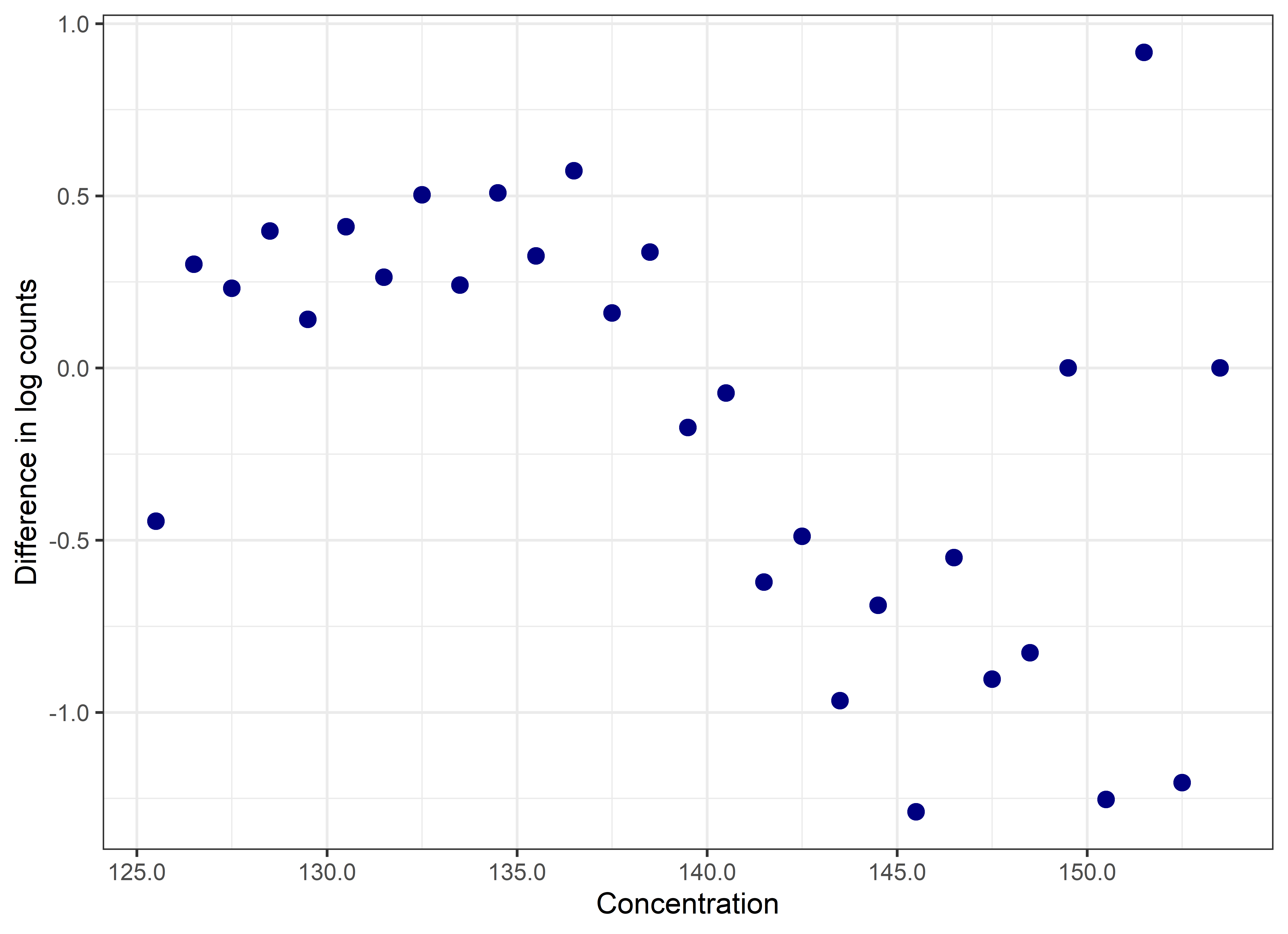
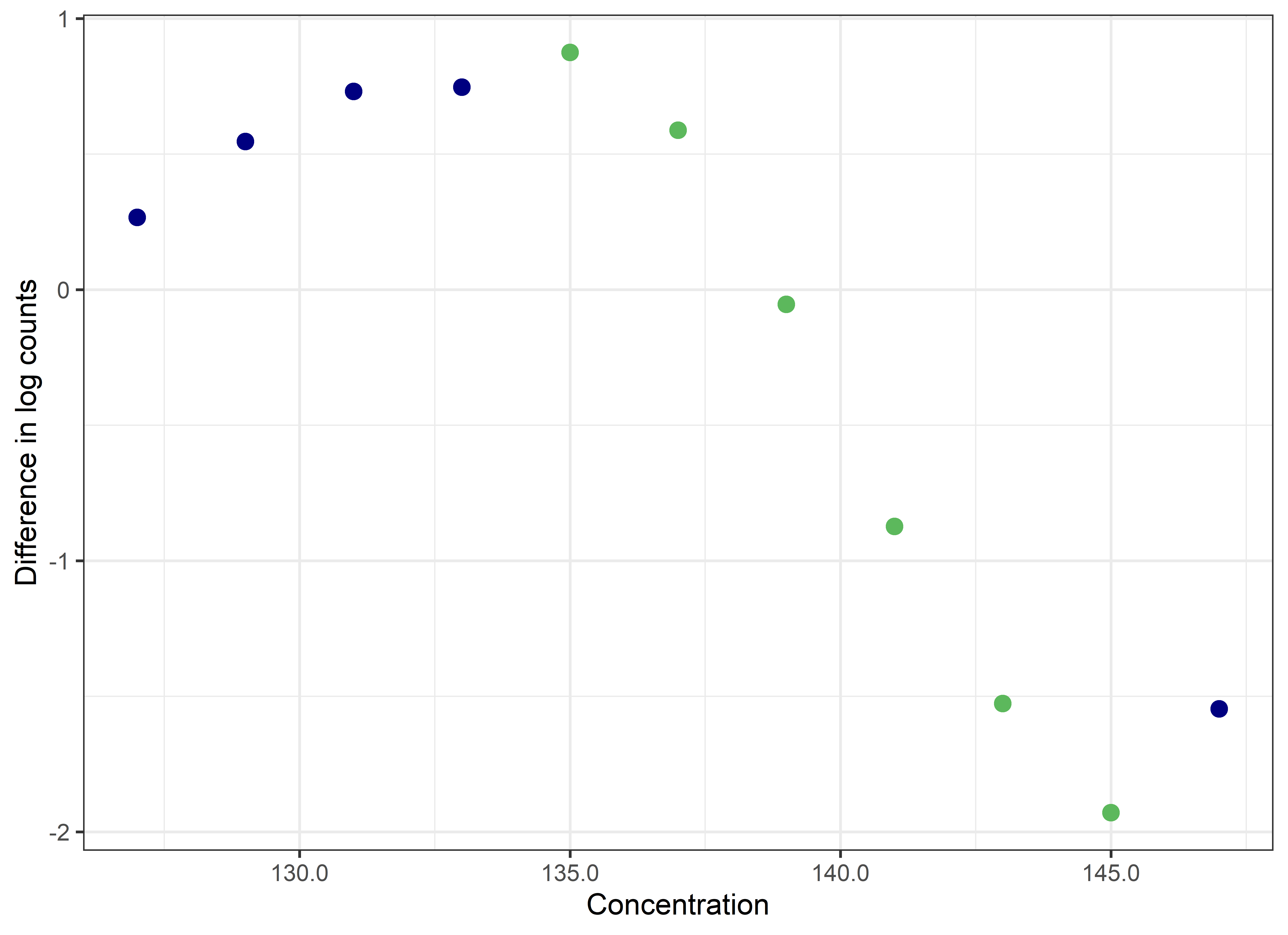
BhattApp will automatically pick a binwidth for the histogram and Bhattagram. Depending on the analyte and filters set, this binwidth may not be appropriate. In particular, the Bhattagram needs to have a series of points that slope downwards in a linear manner. If, once appropriate minimum and maximum values are set, the Bhattagram does not display these points clearly (Figure 1), then manually adjust the binwidth until it does (Figure 2).
 |
|---|
| Figure 1. A ‘messy’ Bhattagram for sodium data. Binwidth defaulted to 1 and a series of points that slope downwards in a linear manner are not clearly displayed. |
 |
|---|
| Figure 2. A ‘neat’ Bhattagram for sodium data. Binwidth has been manually adjusted to 2. The linear points representing the Gaussian portion are clearly apparent. They have been selected (green). |
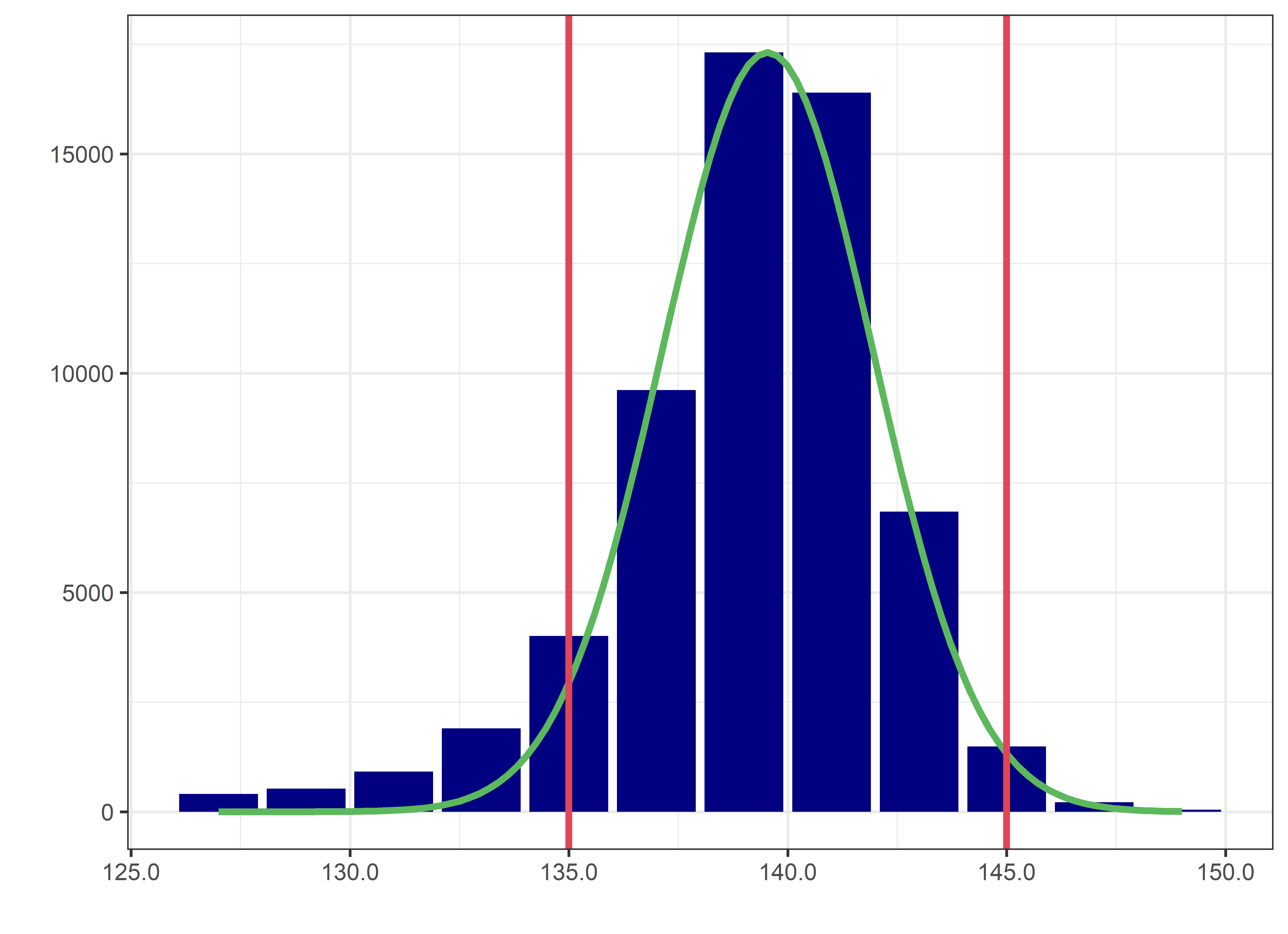
Once the Bhattagram looks good, click on the points that slope downwards in a straight line (they will appear green once selected), then click Analyse. This will bring up a linear regression on the Bhattagram. The histogram will be updated with a Gaussian curve (in green) along with lines representing upper and lower reference limits (red; Figure 3). The reference interval will also be given below the two plots. The number of decimal places used for the reference interval can be adjusted with a slider.
 |
|---|
| Figure 3. Final histogram. The Gaussian distribution identified by the analysis is overlaid in green and the reference interval in red. |
Individual points on the Bhattagram can be de-selected by double-clicking on them. The Clear button will de-select all points. New analyses can be done by simply changing the transform or filtering selections and clicking Analyse.
After analysing, there will be an option at the bottom of the page to ‘show results table’. Selecting this tick box displays a summary table of the data, filters and selected bins. This can help with reproducibility and also allow comparison between analyses. You also have the option to ‘download word report’. This will generate a report with the summary table and graphs from your analysis.
If you have any questions or issues with using BhattApp please email goCrunchAnalytics@gmail.com
